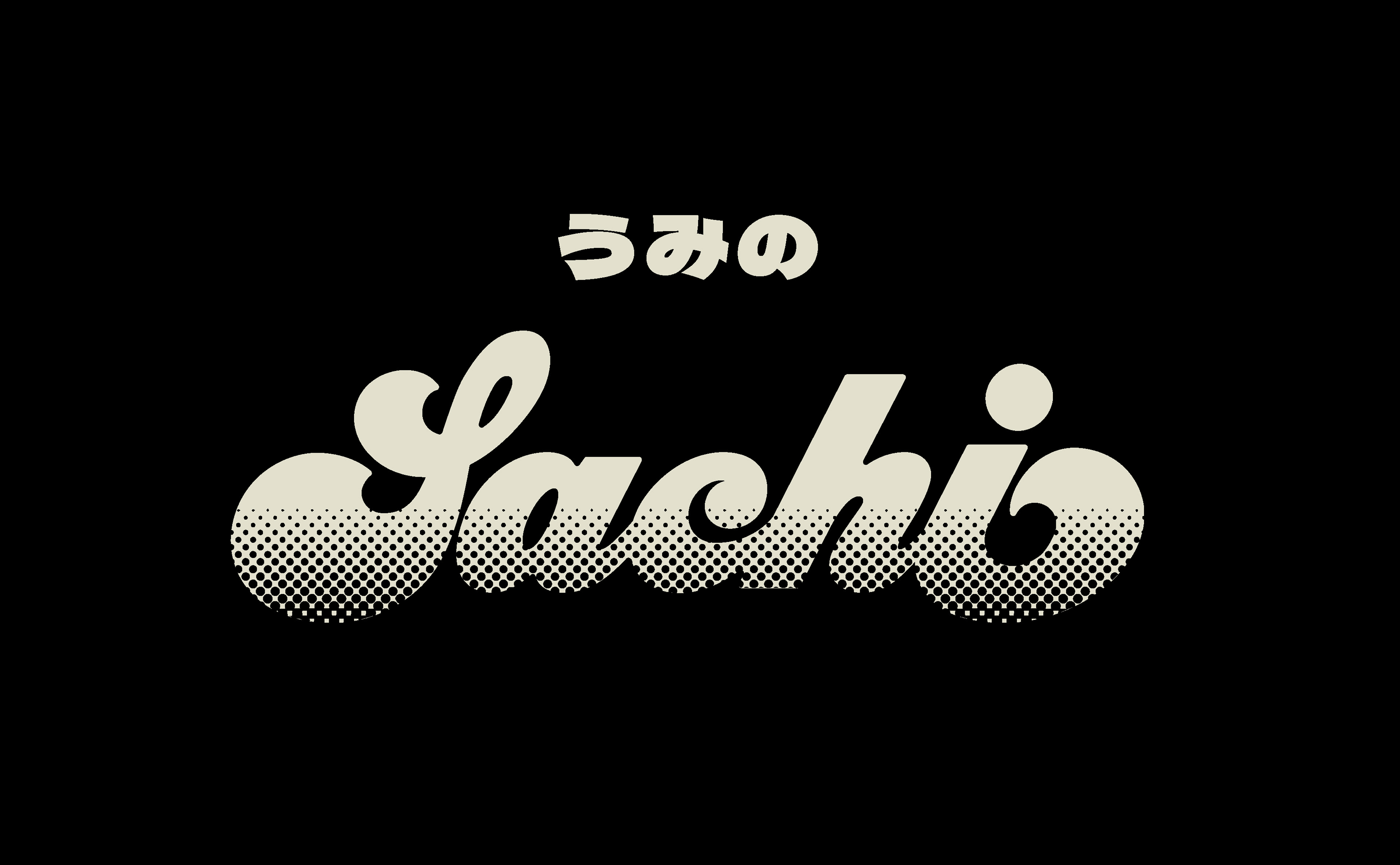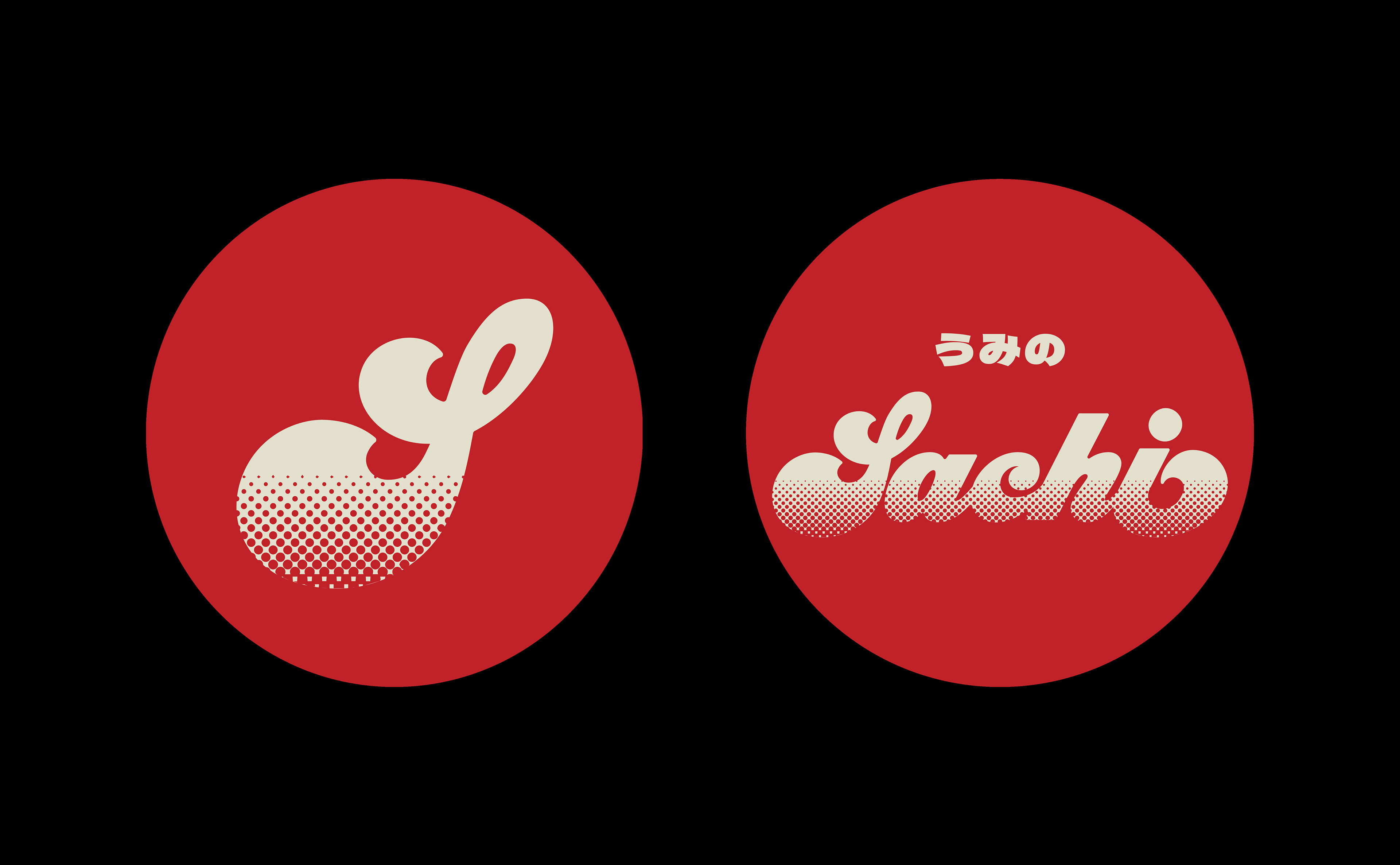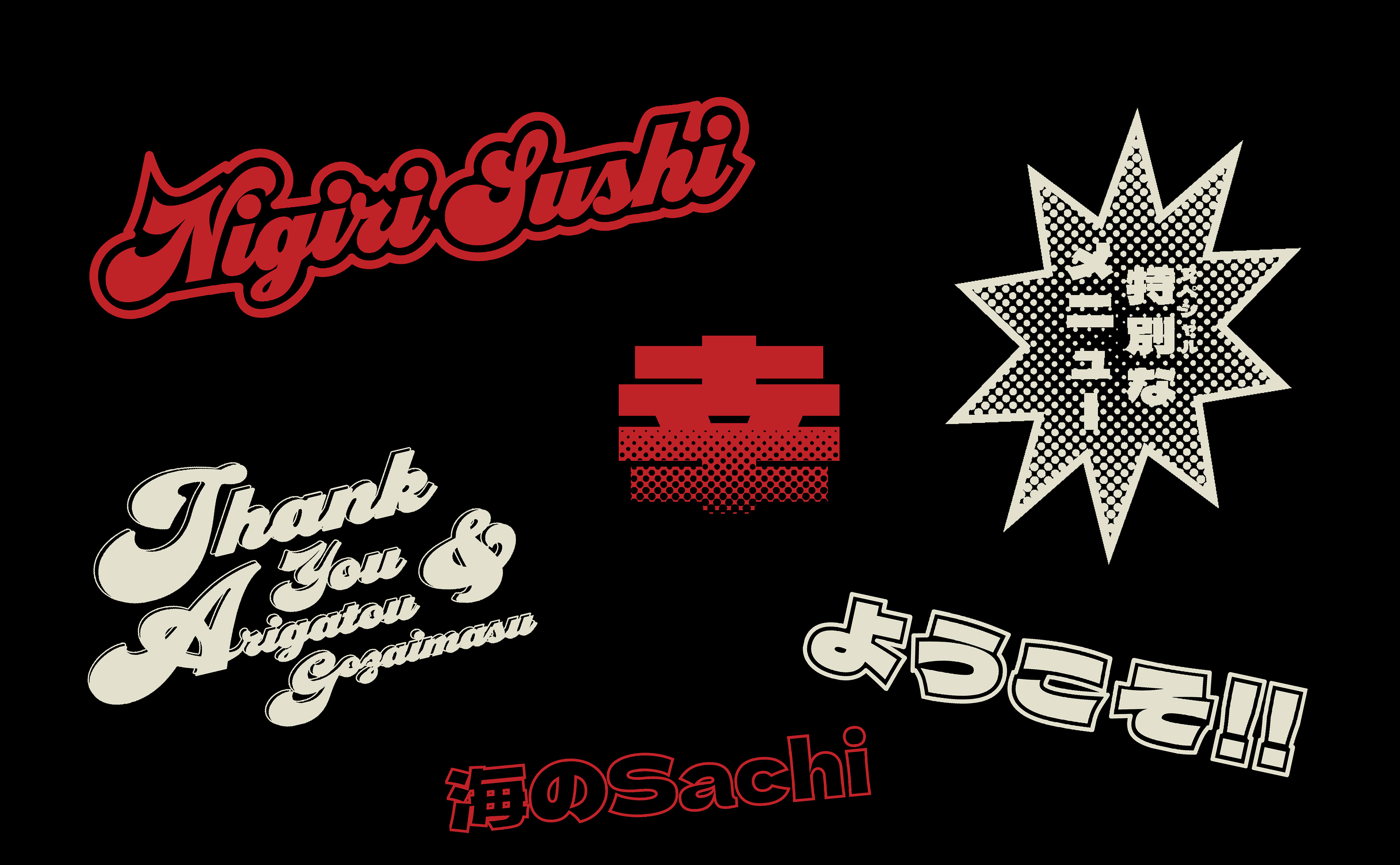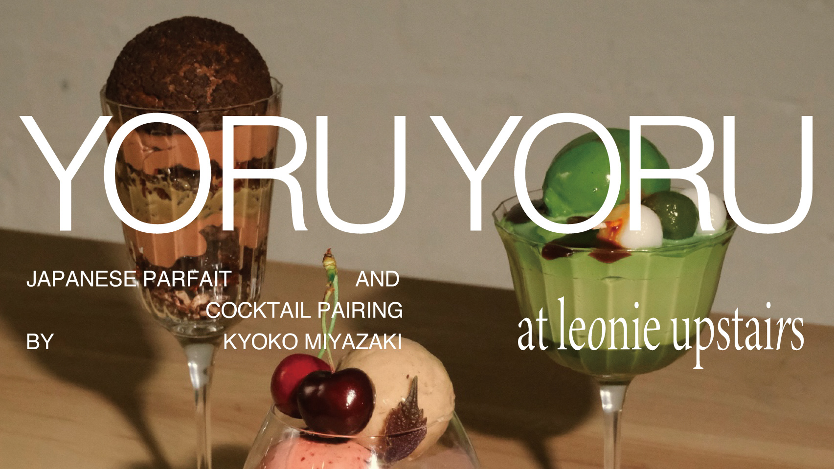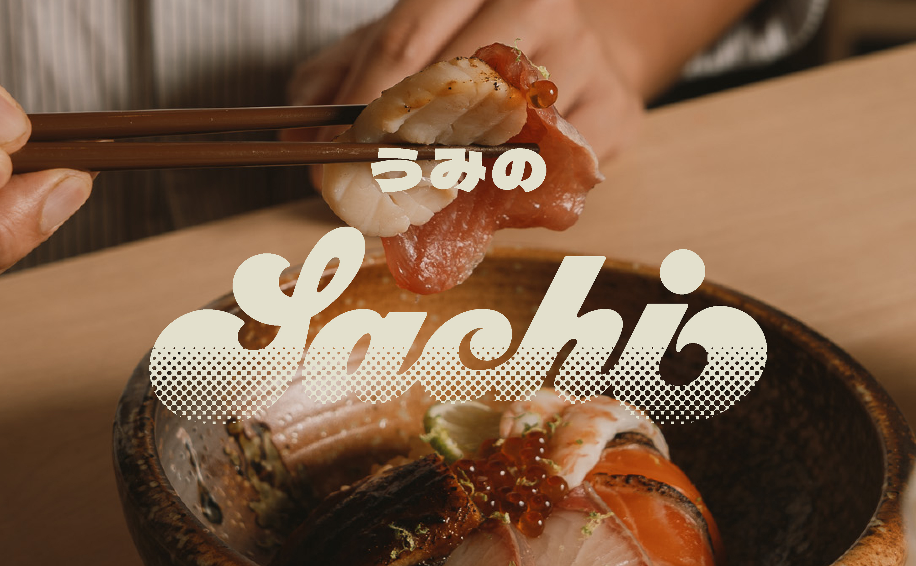
SACHI
A popup restaurant of Chirashi sushi and Omakase, Japanese cuisine in Melbourne. Australia.
CLIENT / AKASHARI PTY LTD, REKI REI
DESIGN / LOGO DESIGN
SPENT HOURS / 3 DAYS
TOOLS / ADOBE ILLUSTRATOR, FIGMA
The owners wanted to encourage young people to eat more Omakase sushi.
Therefore, instead of a classic Japanese design,
The design was based on an old-fashioned but modern 'retro-pop' style.
The reason was that retro-pop fits Sachi's style, which is a modern take on traditional Japanese chirashi-zushi and sushi.
Also because Sachi is named after the Japanese word 'Umi no Sachi', Gifts from the Sea and the Earth
I adopted strokes like ocean waves for the logo.