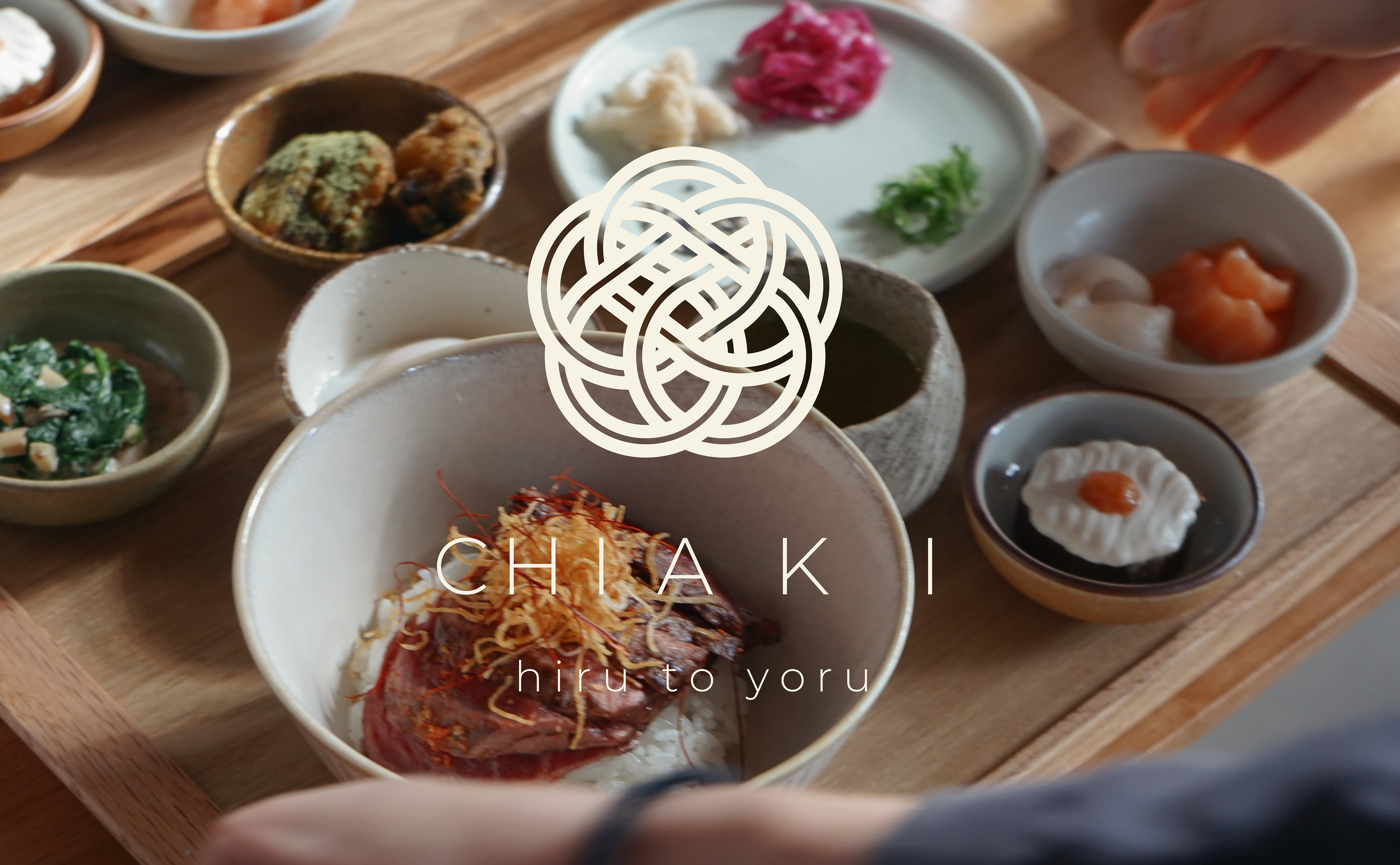
CHIAKI
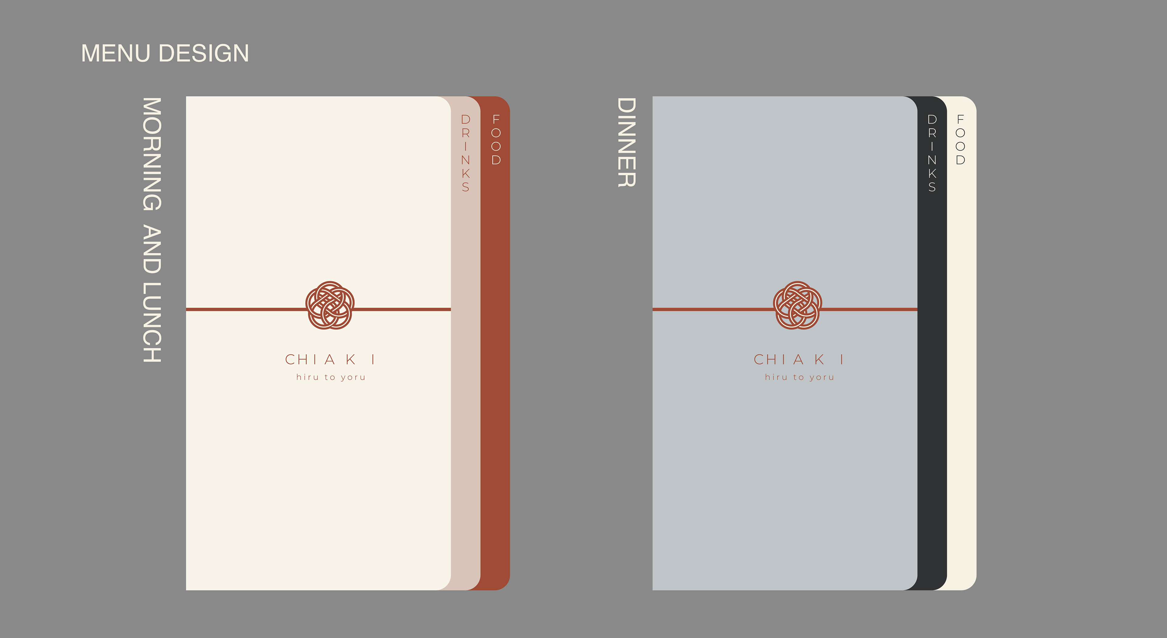
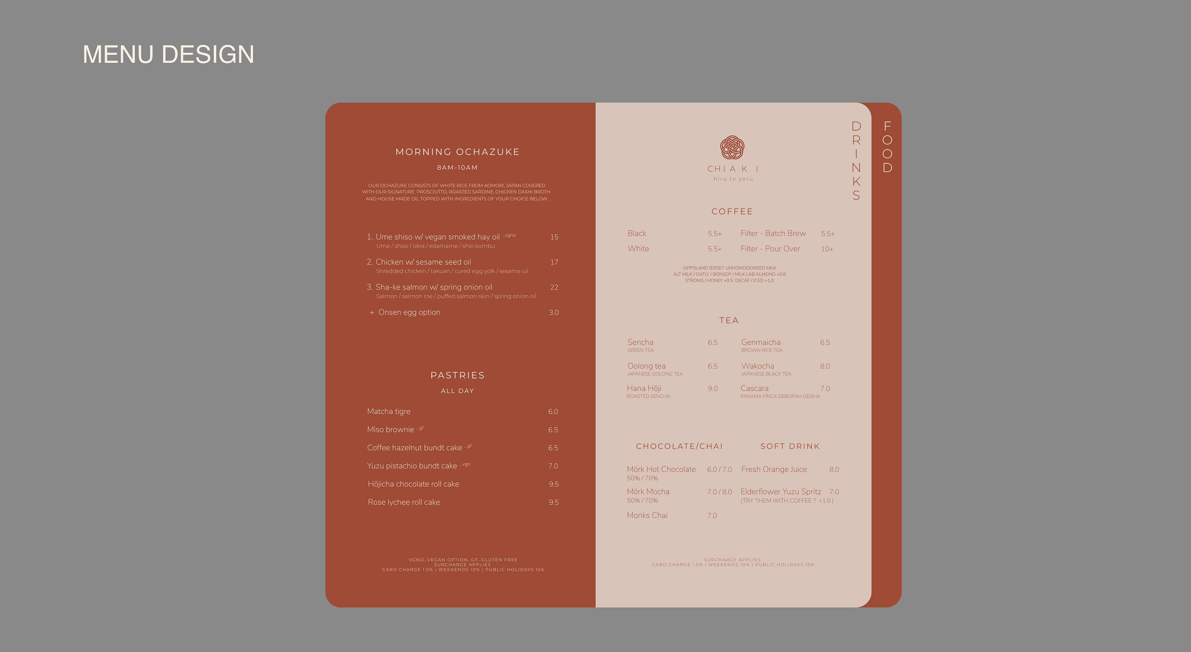
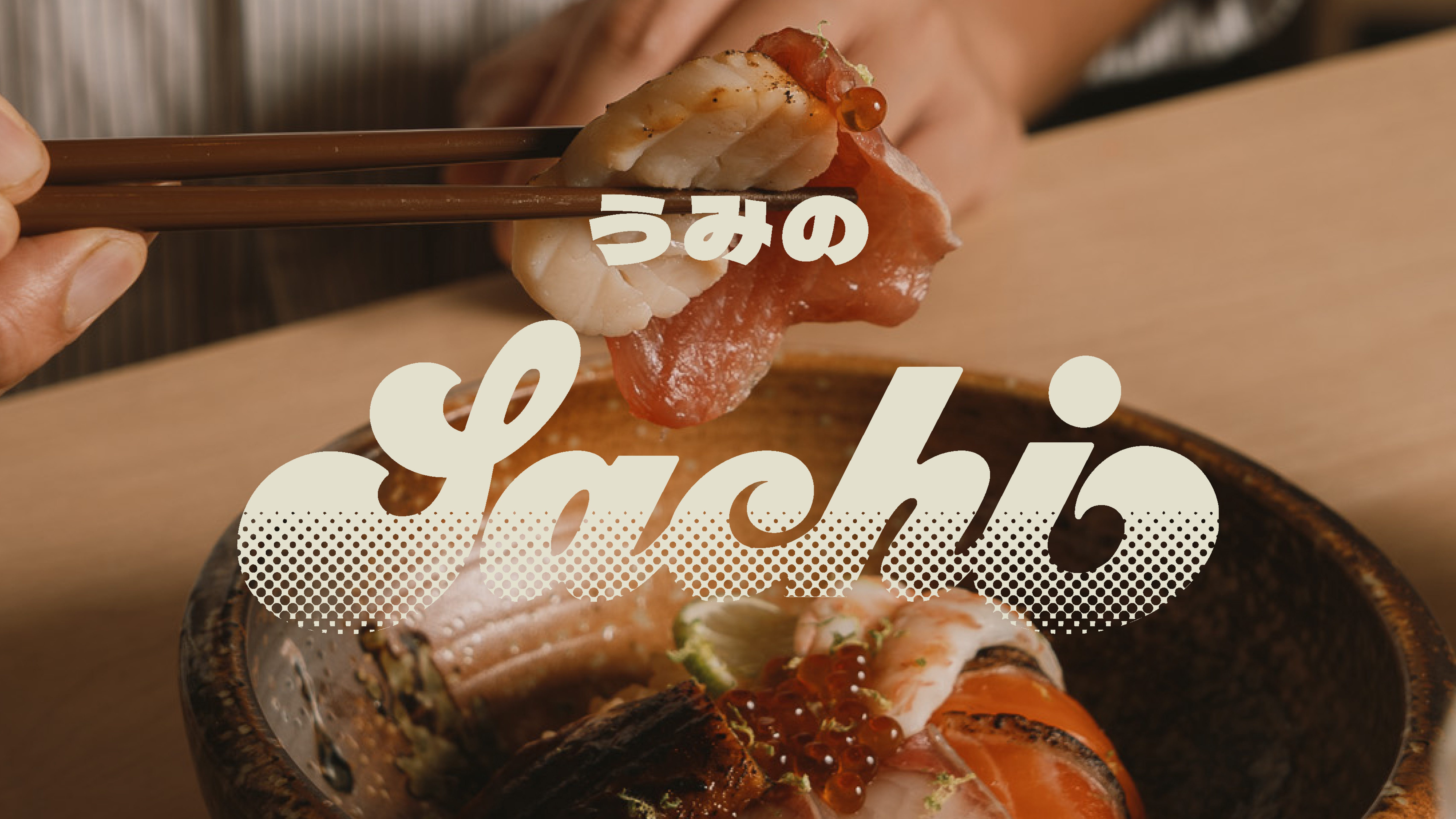
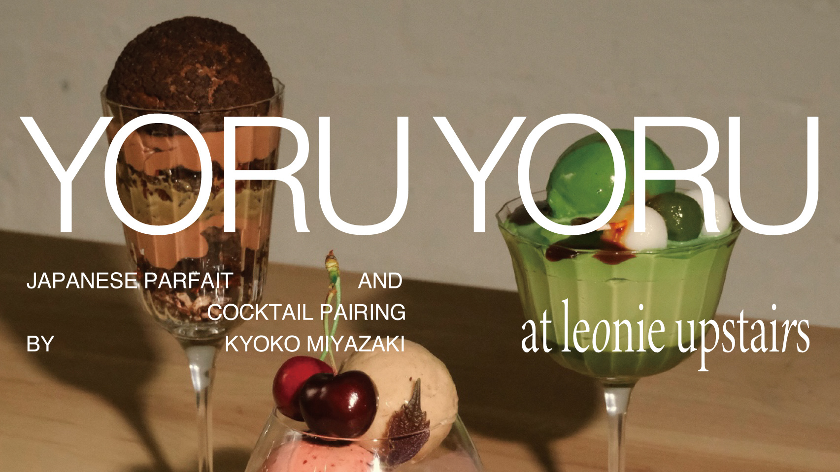
CHAKI IS A RESTAURANT THAT SERVES JAPANESE OCHAZUKE TEISHOKU FOR MORNING AND LUNCH AND JAPANESE FUSION CUSINE FOR DINNER.
THE CHARACTER BETWEEN DAY AND NIGHT IS VERY DIFFERENT.
CLIENT / CHIAKI, MO ZHO, ALICIA FENG
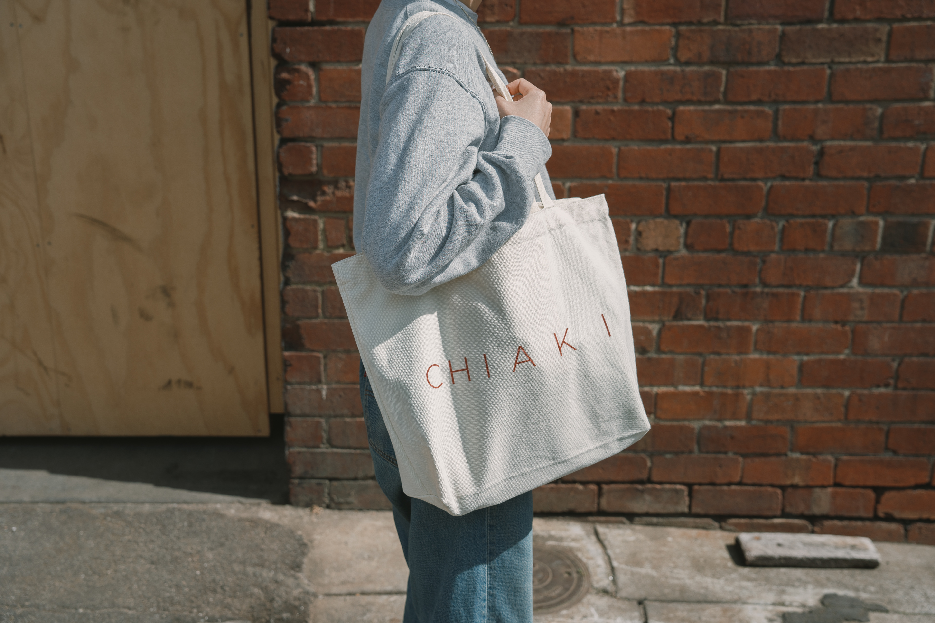
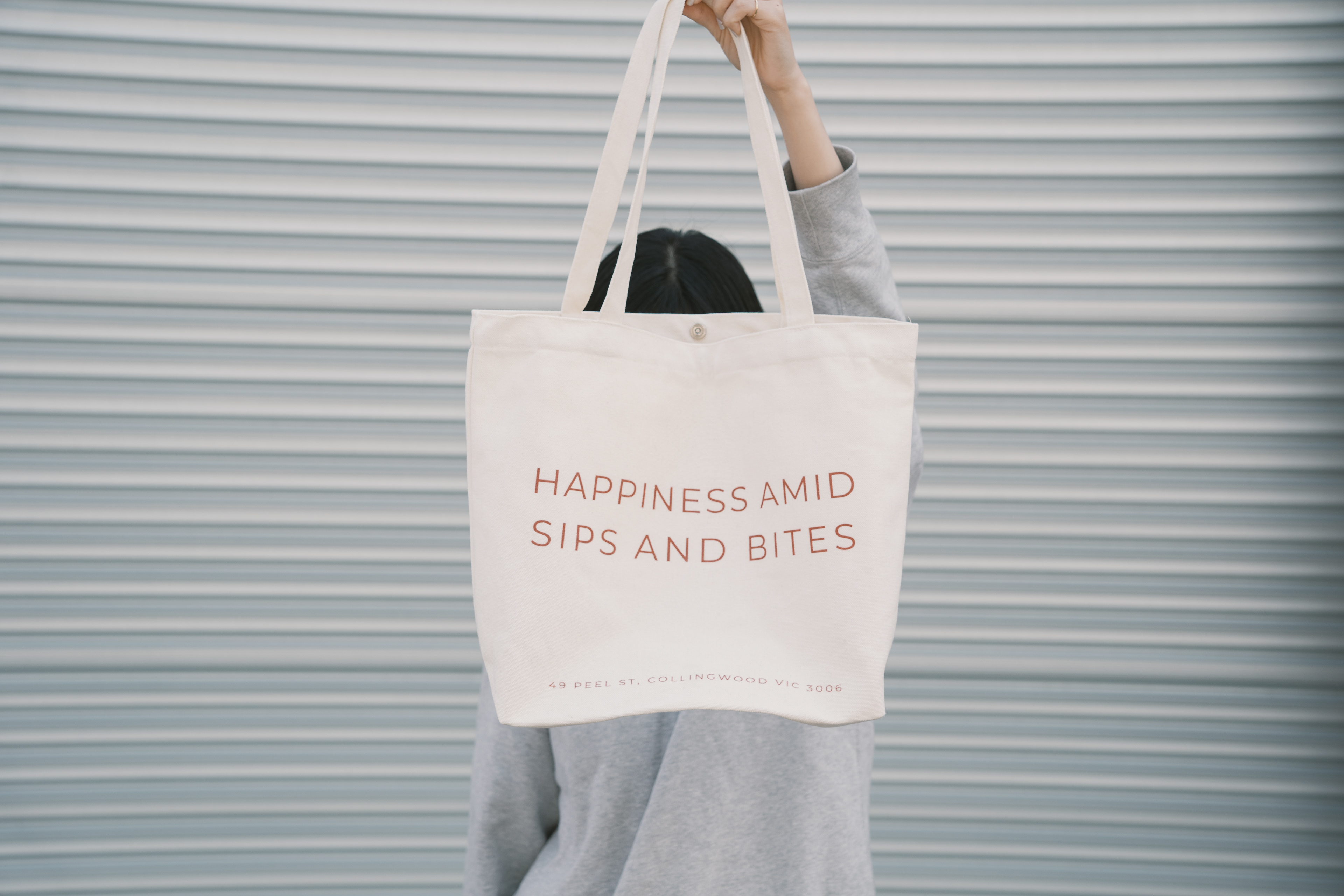
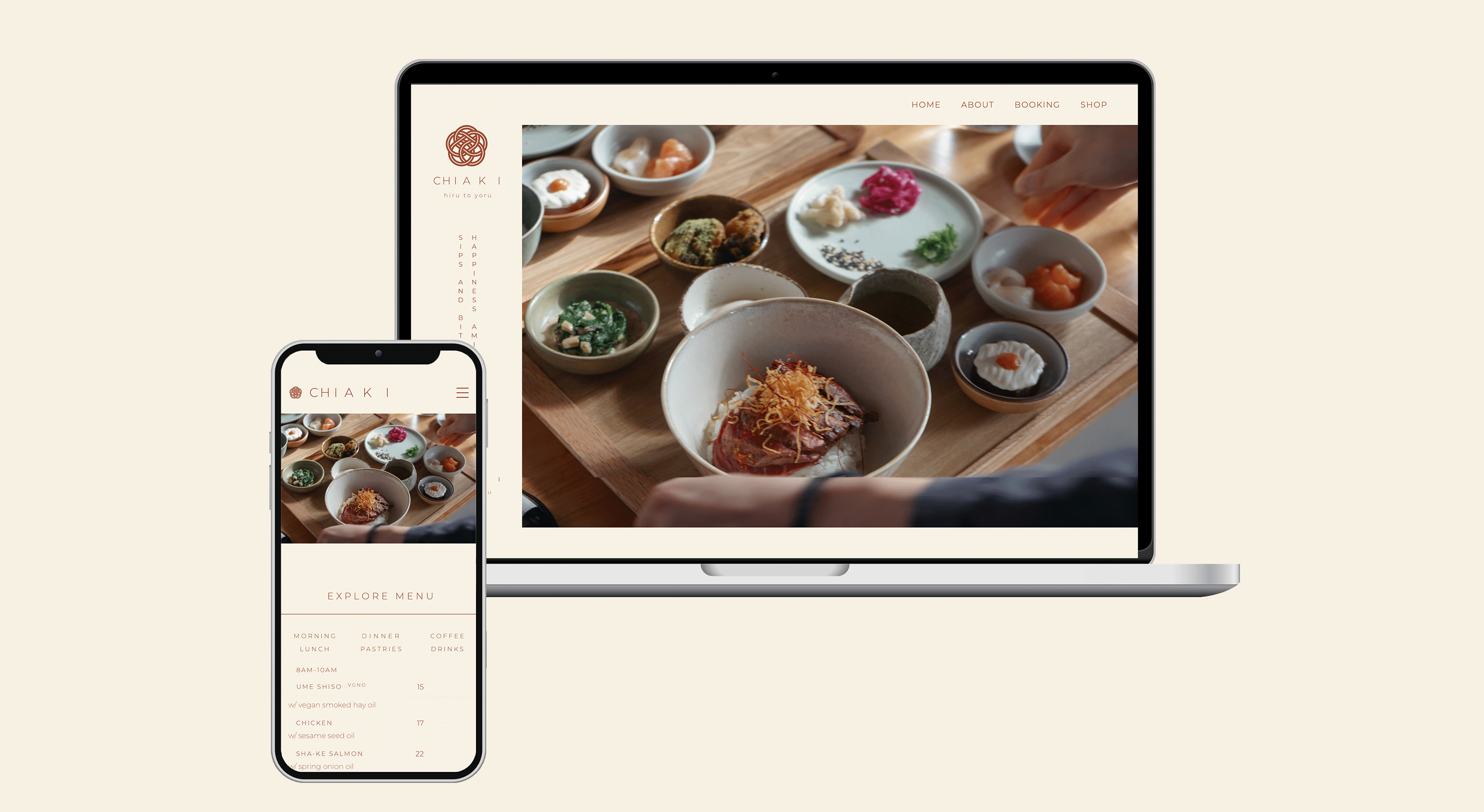
DESIGN / VI, LOGO DESIGN, MENU DESIGN, CARD DESIGN, MERCHANDISE DESIGN, WEB DESIGN, PHOTO DIRECTION
SPENT HOURS / 3 MONTHS
TOOLS / ADOBE ILLUSTRATOR, ADOBE PHOTOSHOP, FIGMA, WEBFLOW
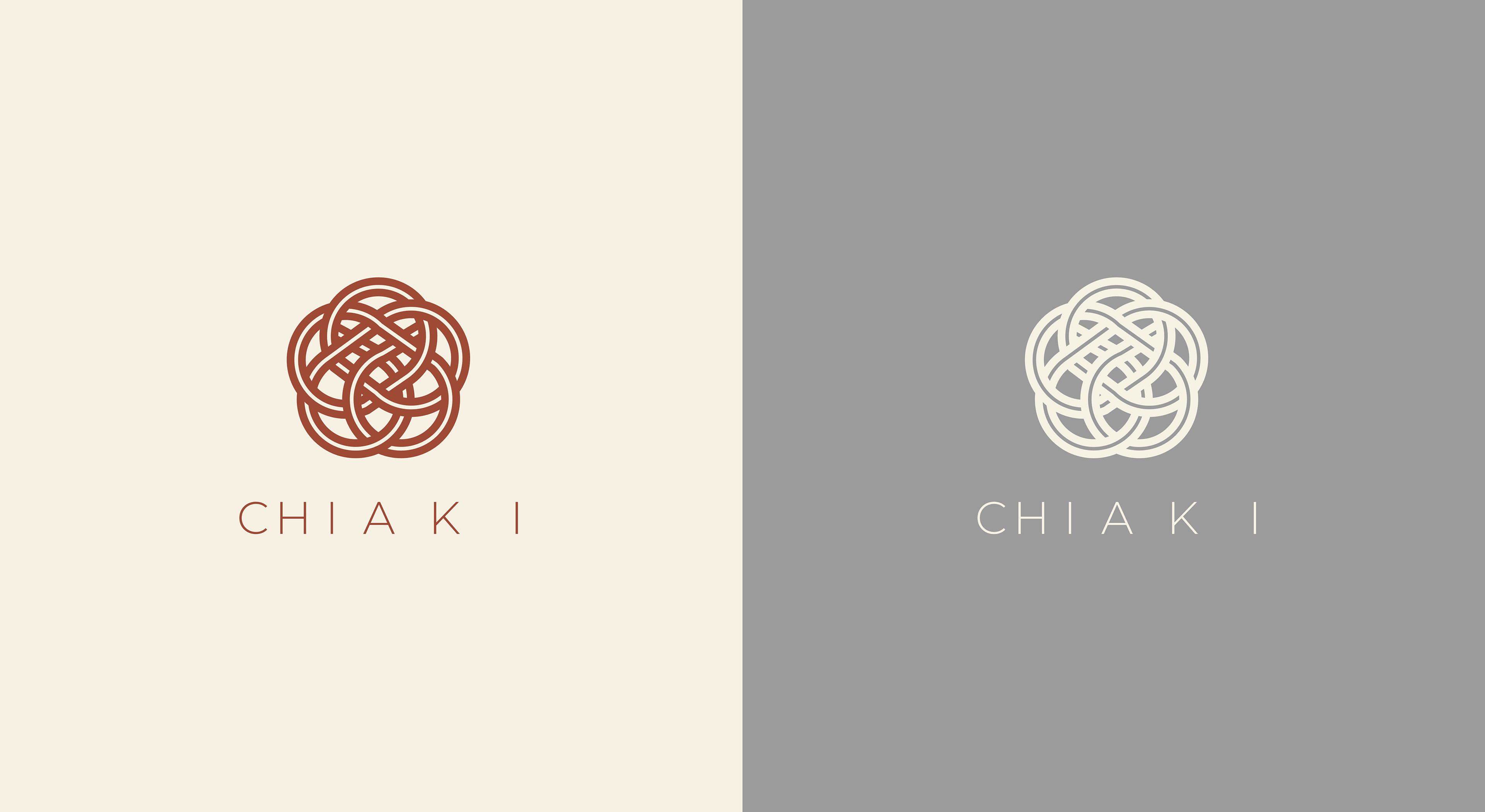
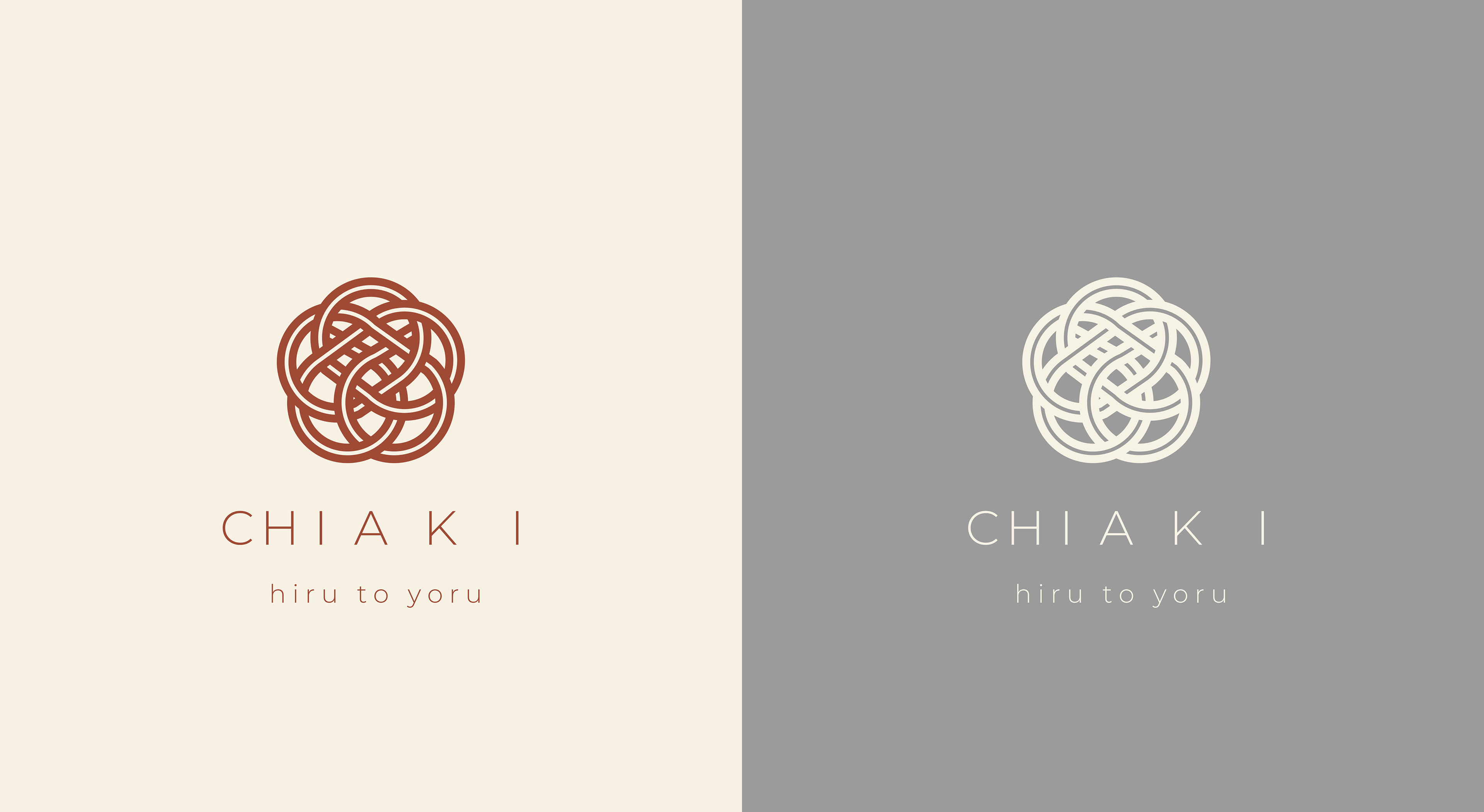
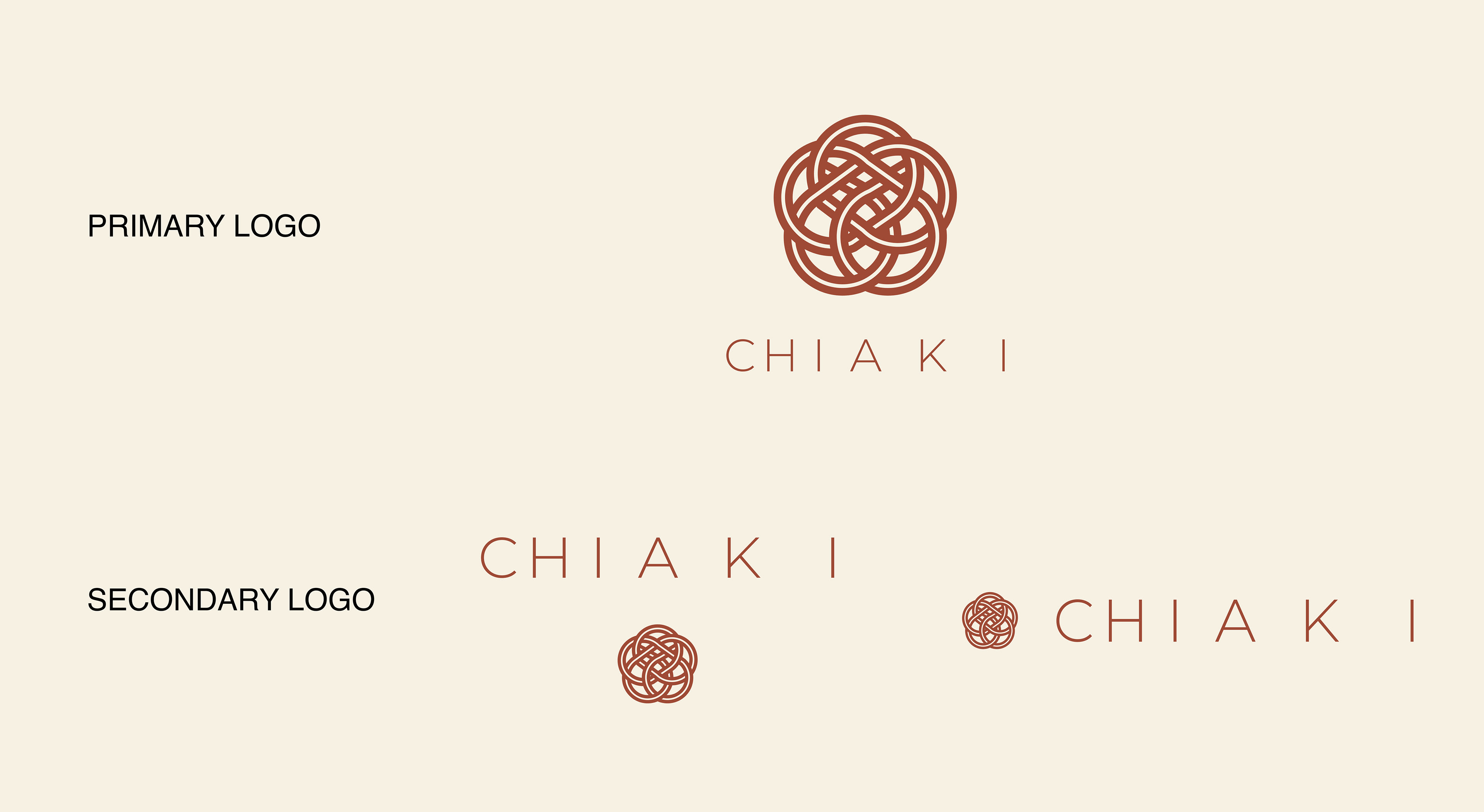
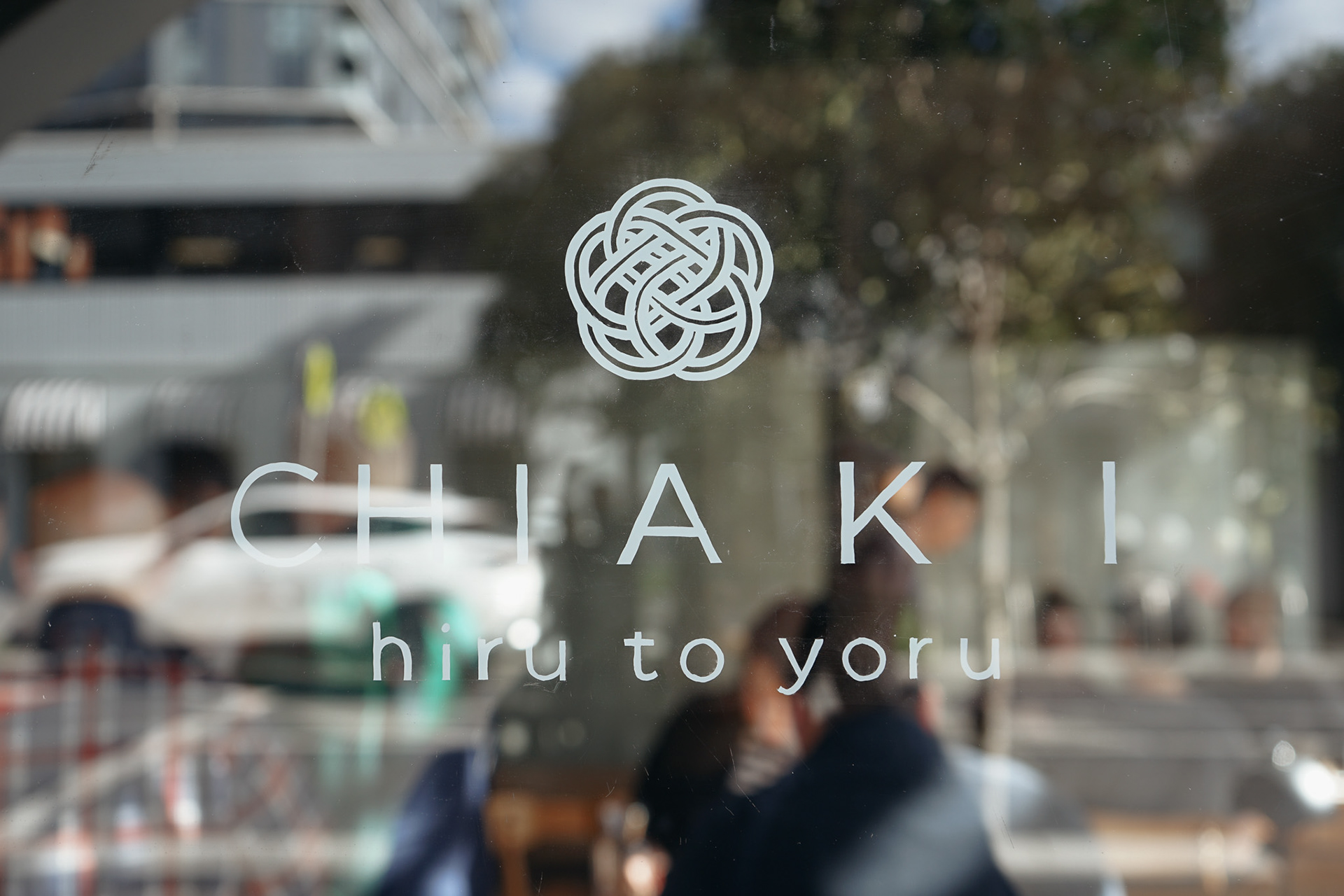
The name Chiaki originates from the phrase 'Ichijitu-senshu', which translates to waiting for a day as if a day has passed for years. This concept, along with the ambition to become a beloved restaurant that everyone eagerly anticipates visiting, is embodied in the logo. The increasing space between the letters in 'Chiaki' symbolizes the longing for the day.
The symbol logo incorporates a mizuhiki motif, a traditional Japanese craft where a single string is woven into floral designs, often used for celebrations. This motif represents the owner's aspiration to form connections with locals and cultivate the business, much like how a single string can be tied together to form a beautiful flower.
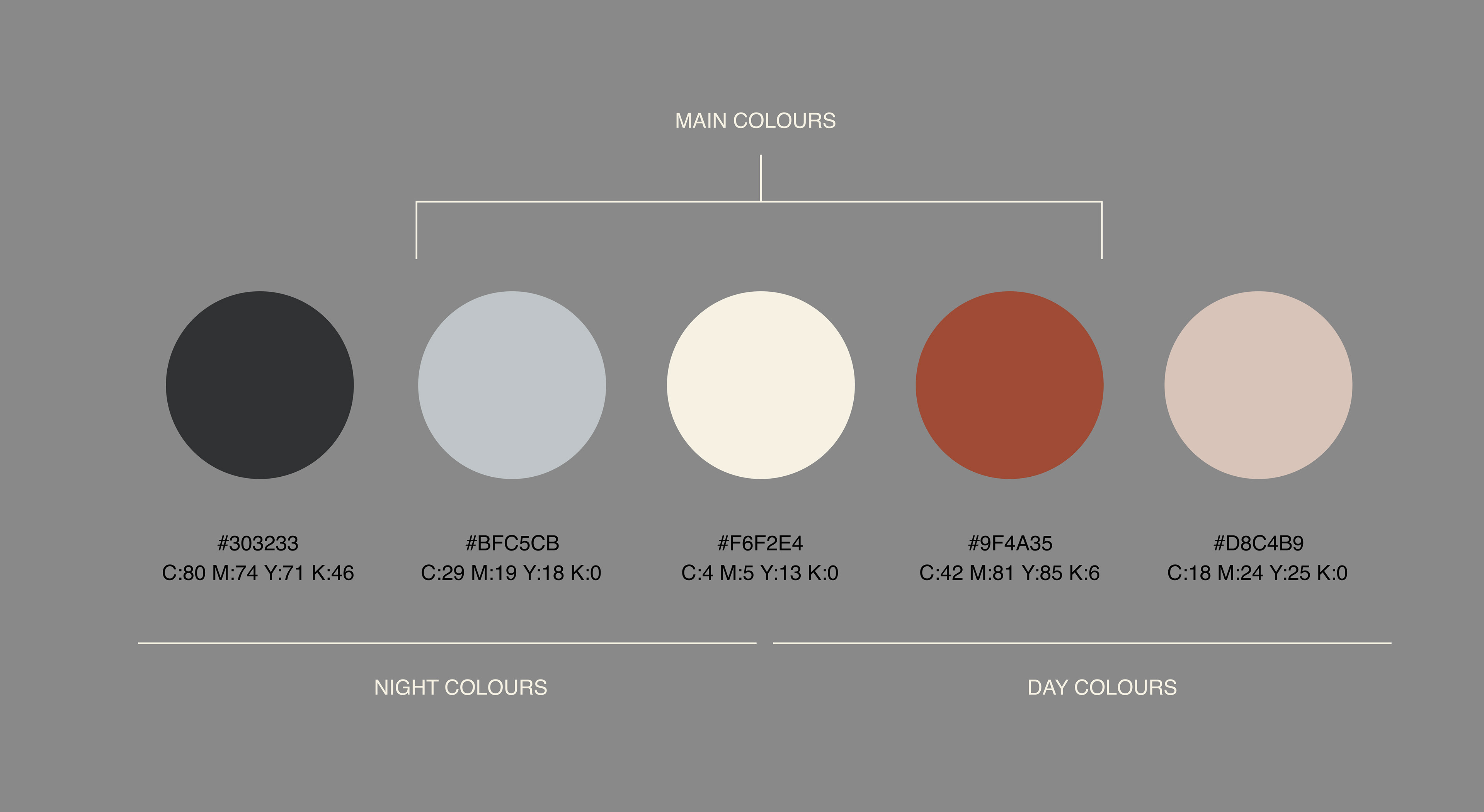
In selecting the colour palette, we were inspired by the warm hues of autumn. This ties back to the phrase "a day and a thousand autumns", and is utilized to reflect the shop's unique transition from a café during the day to a restaurant at night. Thus, the colours change between day and night.